
Motherboard: The World Online
Check out this map to know how many Internet users there are in each country!
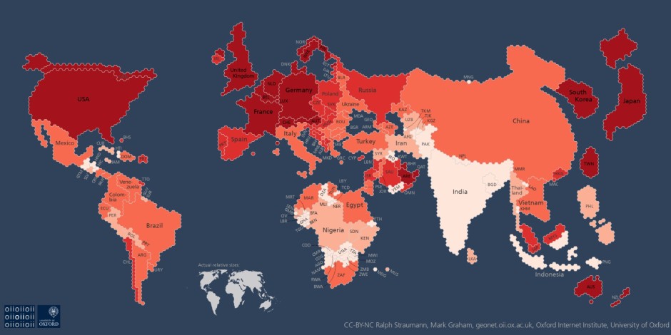
In this curious global map, the world is not as it seems. Just take a look at how massive Japan and the UK look in comparison to teeny-weeny Nordic countries Norway, Sweden, and Finland.
Instead of making a geographically proportionate map, Mark Graham and Ralph Straumann, researchers at the Oxford Internet Institute, drew one up where countries are scaled based on the number of internet users they have.
The researchers visualised the data by using a hexagonal cartogram, with each little hexagonal shape roughly representing 470,000 internet users. Darker shades reveal higher rates of internet access among country populations in comparison to lighter shades. Countries with less than 470,000 internet users have been swiped off the internet-connected map altogether.
The map is an upgrade to one that the researchers made in 2011. This time around, Graham and Straumann visualised their map based on 2013 data gathered by the World Bank. As part of its Worldwide Governance Indicators project, the World Bank has been tracing the number of internet users per country since the 1990s.

- Read more at Motherboard

 Take action now!
 Sign up to be in the loop
 Donate to support our work